Repository navigation
Conversation


The old icons were hard to make out at their typical size. The new icons are
clearer, and avoid the lock iconography in order to avoid creating confusion
with the lock icon in the URL bar.

Adds new icon type:
  "inactive" indicates that no rules applied on a given site.
  "disabled" indicates HTTPS Everywhere is disabled.

Disables the counter by default on Firefox (you can still turn
it on manually), and adds a new icon state "inactive."

|
This looks great! I can do a more comprehensive code review on Monday. |

| "48": "icons/icon-active-48.png", | ||
| "128": "icons/icon-active-128.png" | ||
| }, | ||
| "incognito": "split", |

There was a problem hiding this comment.
Any reason you went back to split incognito? (I'm guessing this was a merge issue)
There was a problem hiding this comment.
Yep, merge issue, thanks for catching!
| chrome.browserAction.setIcon({ | ||
| path: newIconPath | ||
| var updateState = function() { | ||
| chrome.tabs.query({active: true}, function(tabs) { |
There was a problem hiding this comment.
You'll want to pass currentWindow:true here, too.
Otherwise, creation order determines the tabs array, and with multiple windows, multiple tabs can be active.
Example:
- Open a tab to a weird page (e.g. chrome://extensions)
- The extension icon will show as inactive
- Open a new window, and browse -- the icon state won't change
There was a problem hiding this comment.
Fixed, thanks.
This has the unfortunate side effect that if you have two windows visible at once, the icon in both windows will reflect the state of whichever window is currently focused, and switching windows will change icon state (if it's different). We could probably fix this by switching back from browserAction to pageAction, but I'm not very excited about that. Probably the current behavior is fine.

|
Awesome -- Chrome bits LGTM (& tested on Stable) and they're supported in WebExtensions for an eventual FF code merger (e.g. https://developer.mozilla.org/en-US/Add-ons/WebExtensions/API/Tabs/query ). I agree the current behavior is fine -- going back to pageAction would be pretty annoying. |
|
When you move HTTPS Everywhere to behind the hamburger menu, the icon becomes much blurrier:
Can we make it clearer, like in the |

|
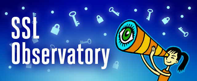
Within the IMHO it seems more desirable to have a banner that's more specific to the observatory, just so people have a clearer indication of what they're looking at. It also looks like the image width/height ratio is lessened from the original to give it a squished look, probably worth it to fix that. |
|
everything else lgtm |


The old icons were hard to make out at their typical size. The new icons are
clearer, and avoid the lock iconography in order to avoid creating confusion
with the lock icon in the URL bar.
Adds new icon type:
"inactive" indicates that no rules applied on a given site.
"disabled" indicates HTTPS Everywhere is disabled.
Disables the counter by default on Firefox (you can still turn
it on manually), and adds a new icon state "inactive."
cc @semenko, @cooperq, and @Hainish for review and test.